
I/O Topology Tool
IBM, INFRASTRUCTURE MONITORING
Problem statement
System administrators and hardware planners working in large banks, airline and IT organisations rely heavily on IBM’s hardware and I/O resources. Today, they lack an intuitive and modern solution to help them consume or understand their I/O resource configurations, specifically how adapters are connected to switches and storage ports. They use static spreadsheets and manual diagrams, which impede their ability to validate setups and troubleshoot issues efficiently.
Role and team
I was the sole Visual Designer on the project. I worked on UX solutions alongside a team of 5 UX Designers, 1 User Researcher, 1 Product Manager, and 10 Developers.
Duration
The first release took 1 year
Customer engagements
40+ hrs, 14 companies
USER RESEARCH
Personas and pain points

Representation of a customer’s infrastructure environment
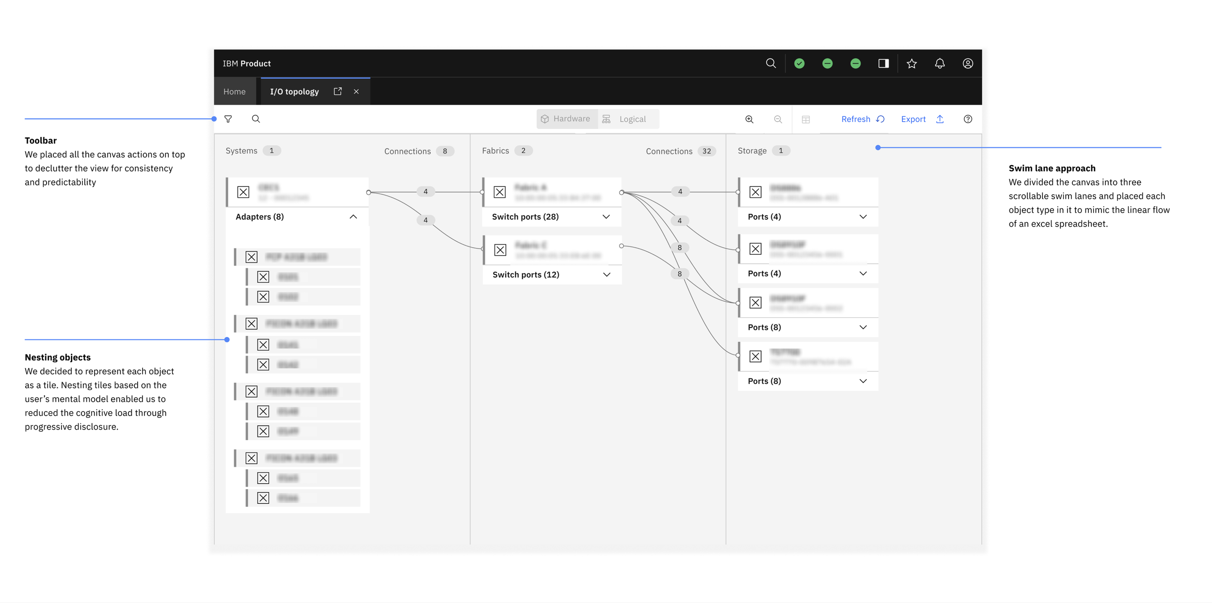
Customers typically have 3 types of objects that make up their environment: Systems, Switches and Storage servers. The sheer quantity and complexity of the connections between them makes it difficult to both document and consumer.

Manual diagrams and excel spreadsheets
Today, users create manual drawings or excel spread sheets to record their infrastructure and configurations. These solutions are error prone, unreliable and difficult to consumer, especially for novice users.
Low-fidelity concepts
Fleshing out a rough concept
My team and I started out by re-creating our customers’ environments based on their excel spreadsheets and diagrams to see if we could identify any patterns. We noticed that there were three recurring objects and realized we could structure them into three distinct columns. This observation evolved into our scrollable swim lane approach where we placed each object type into a distinct swim lane, allowing connections to span across lanes.

UX DESIGN
UX solutions to address key pain points
User research
User testing
My team and I constantly tested our mid-fi prototypes at numerous customer engagement events where we gained valuable feedback that helped us iterate on the designs. For more insights into how we used these customer insights to inform our design decisions, please reach out for the detailed case study

HIGH-FIDELITY DESIGNS
Adding texture to the canvas
When I started working on the high-fidelity designs, I wanted the canvas to have a dynamic, visually interesting feel so I decided to use a dotted background. I also introduced pops of color through gradient to break the monotony of the components on the canvas.

High-fidelity designs
Opportunities to use visual design to enhance mid-fi designs

Cleaning up the clutter
In the mid-fis, the parent connectors have a summary pill indicating the number of children nested beneath. While this information is relevant, it made the canvas look cluttered and overwhelming. I decided to show this summary only on hover, given that customers would like to know the children on only specific connections.
High-fidelity designs
Modular approach to visual design, building on IBM’s design system
IBM’s Carbon Design System provided basic card node components in the documentation, but the guidance was limited. The Figma library lacked pre-built components, and the documentation didn’t account for all the interactive states needed for our use cases.The modular, componentized approach to designing the high-fidelity assets also allowed us to adapt to changes quickly, automatically updating each screen without the need for cumbersome manual edits. I also created custom illustrations for each node to serve as visual identifiers, helping users easily scan and locate the objects they were looking for.

MOTION DESIGN
Elevating mundane scenarios with conceptual motion design

USER FEEDBACK
“The visualization is marvelous. Doing HCD [previous, manual tool] stuff is pretty cumbersome to do. This makes a world of a difference.”
Next steps
Success metrics
Because the I/O Topology tool is bundled for free with IBMz mainframes (Systems), we can’t rely on traditional product metrics such as adoption rate, conversion rate, or direct revenue impact to measure success.
Instead, we assess the tool’s impact using the following indicators:
1. The tool was developed in direct response to urgent customer requests. Multiple clients expressed frustration with existing methods, highlighting a clear unmet need. Positive quotes indicate that the solution surpassed their needs.
2. In the next few months, our researcher plans to collect user experience metrics such as SUS scores and first/time user success rate to measure the design quality
While we may not track monetization or adoption at scale, these qualitative and behavioral metrics help demonstrate value, reduce customer effort, and differentiate IBM’s support experience.
Reach out to me for the extensive case study presentation which includes more descriptions of UX solutions and detailed visual design decisions ☕