

Partition management experience
IBM, DYNAMIC PLATFORM MANAGEMENT
Team and role
The team is comprised of our design lead, 1 user researcher, 2 UX designers, a UX intern and myself as the hybrid visual/ UX designer.
Duration
The entire end-to-end design process of this shipped product took 2 years.
Eminence
iF award winner 2023, in the category Product UX.
German design award winner, 2023.
Featured in a medium article by the VP of design at IBM
Problem statement
As experts are retiring, novice users no longer have the proprietary skills to operate complex command-line based interfaces to manage virtual servers. Users need a guided and modern experience to confidently and independently manage virtual servers, without wasting time looking through outdated documentation.
In this case study, I will highlight a sub-set of the experience that I drove, from understanding our personas to crafting high fidelity designs, to enable junior system administrators to assign cryptographic resources to their virtual servers.
USER RESEARCH
Primary persona, needs, pains and hills
Our primary persona is a junior system administrator whose daily tasks include monitoring infrastructure and creating virtual servers. Through interviews with over 40 customers from over 10 of the largest banks, retail and IT providers in the world, we uncovered the following pain points:
- Lack of expert-level domain knowledge
- Long, unguided processes
- Insufficient awareness of dependencies
- Vague error indicators and paths of resolution

“There is an unimaginable pressure on junior system admins to perform and there are not enough experienced users to help them“
—Senior System Administrator
ENGAGEMENT WITH SMEs
Understanding the domain
Having no background knowledge on cryptographic configurations I was forced to start from scratch. Through conversations with technical experts, I was able to sketch out the technical concept and translate that into a mental model diagram of how a user would configure this resource.

01–
Audit and Analyse using a heuristic evaluation
My team and I laid out the current command-line based/ legacy UI interfaces and tried to understand and analyze how it was used to operate a task from a technical perspective.
Our researcher also conducted multiple usability studies and shared insights on pain points and user needs.

02–
Understanding mental models
Through conversations with subject matter experts, I understood the technical concepts behind physical
and virtual cryptographic configuration. I visualized the process of configuring physical and virtual cryptographic resources, in a way that was logical and consumable for a user.
CRAFTING SOLUTIONS
Low-fidelity and mid-fidelity designs

01–
Low fidelity, crazy 8 sketches
I stared with crazy 8 sketches– 8 wild ideas to solve the problem of simplifying cryptographic configuration. We voted on the best 3 approaches.

02–
Mid-fidelity, adding more detail
These 3 approaches were converted
into mid-fidelity concept. I conducted a usability test with sponsor users to see which approach resonated best.
USABILITY TESTS
Mid-fidelity iterations and insights from usability tests

01–
Progress indicator
To guide a user through the different steps of configuring physical and virtual resources,
we tried a progress indicator. This felt too detached for a user. The underlying layer of the experience also used a progress indicator so we quickly eliminated this solution.

02–
See and select domains
We placed the physical and virtual resources side by side to reinforce the mental model. Users loved this. We also presented all the domains to allow a user to see everything and decide what to select. This made users feel more confident about their selection.

03–
Collapsible tiles
We divided the physical and virtual configuration into collapsible tiles to avoid confusing the user but users missed the second tile, for virtual configuration.

04–
Manually enter domains
We had the idea to allow a user to type in a domain to see if it was available based on the assumption that users already know what to pick. We quickly realised that this was a good idea in theory but this took too long, given that users could select up to 200 domains.
UX SPECS
Creating exhaustive UX specs and
documenting different use cases
While the presentation is focused on cryptographic configuration, a user must configure other resources such as memory, processors, network etc. to create a virtual server. This means error handling must be consistent across each step. My team and I created notification and tooltip specs to help resolve errors. We ensured the content design was consistent across each step. In addition, we needed specs for notifications and tooltips if more than one resource turned into an error state.

VISUAL DESIGN
Adding visual maturity to enterprise products

01–
Understanding the hardware
A user essentially uses our product to configure and monitor physical hardware with digital interface. I had the idea of creating digital representations of physical hardware to bridge the gap. The process began with studying videos of the hardware in different angles.
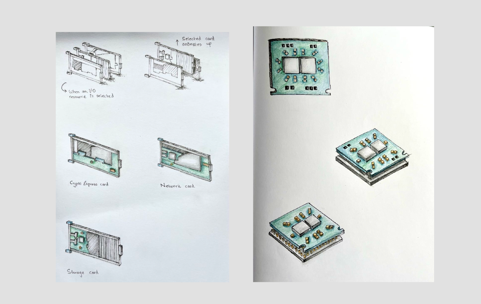
02–
Pen and paper sketches
I work best with pen and paper. I created color pencil renditions of the hardware in an isometric style. This process helped me make quick stylistic decisions on which elements to remove and what to add for visual interest.

03–
Design system
Once my team and I aligned on which worked best, I studied the color palette of IBM’s design system and chose shades that came close to our physical hardware. I also studied the shadows and other stylistic elements to understand how to apply them to the digital renditions.

04–
Digital illustrations
I finally created different variants of digital illustrations on Illustrator. I ran them by my team and other visual designers till I felt confident sharing the final assets.
VISUAL DESIGN
Family of hardware illustrations

How the library came about
The family of hardware illustrations starting with a single sketch. The sketch got a lot of traction and attention among stakeholders and the design org. It eventually evolved into
a cohesive family used throughout the product. After sharing this process in one of our design community calls, a lot of product teams reached out asking for similar illustrations.
VISUAL DESIGN
Adding Visual maturity to the product

I think that going the extra mile to polish and perfect the final design of an experience show a user that we genuinely care about giving them a delightful experience. Some ways I tried to do this are by making our screens completely responsive.
I also went through the arduous process of convincing our engineers to implement micointeractions in our product. I quickly realized that some of their hesitation was from a lack of experience. We worked together to craft a motion handover spec which ended up being a huge success.

Animated explainer videos
I created animated explainer videos to help novice users understand technical concepts.
Final designs and testing
We tested our designs with sponsor users who had an extremely positive response to the outcome. Our dedicated researcher created a survey and the results are as follows: 100% task completion rate | 17% Error rate.
“The HMC is like a hot potato. No one wants to take it (the redesign) up but this is exactly what we’re looking for”
––System Administrator, Banking

Before you go…
Here are some picture of this mainframe cake that a co-worker and I made of the product we work on (I design a digital B2B platform to operate the mainframe).


