


Senior Thesis
INDIC TYPEFACE DESIGN
Description
The influx of western influences and globalization in India have increased the popularity of English as a spoken language among the urban, Indian youth. English connotes status. As a result, many young Indian, including myself, have grown up without learning or practicing our mother tongues. My typeface, Bangalore Display, questions whether typography can change the attitude of the Indian youth and inspire them to learn and speak their regional languages.
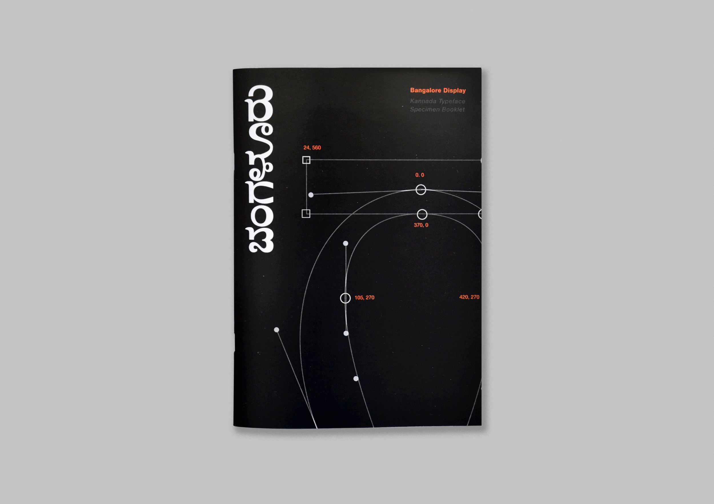
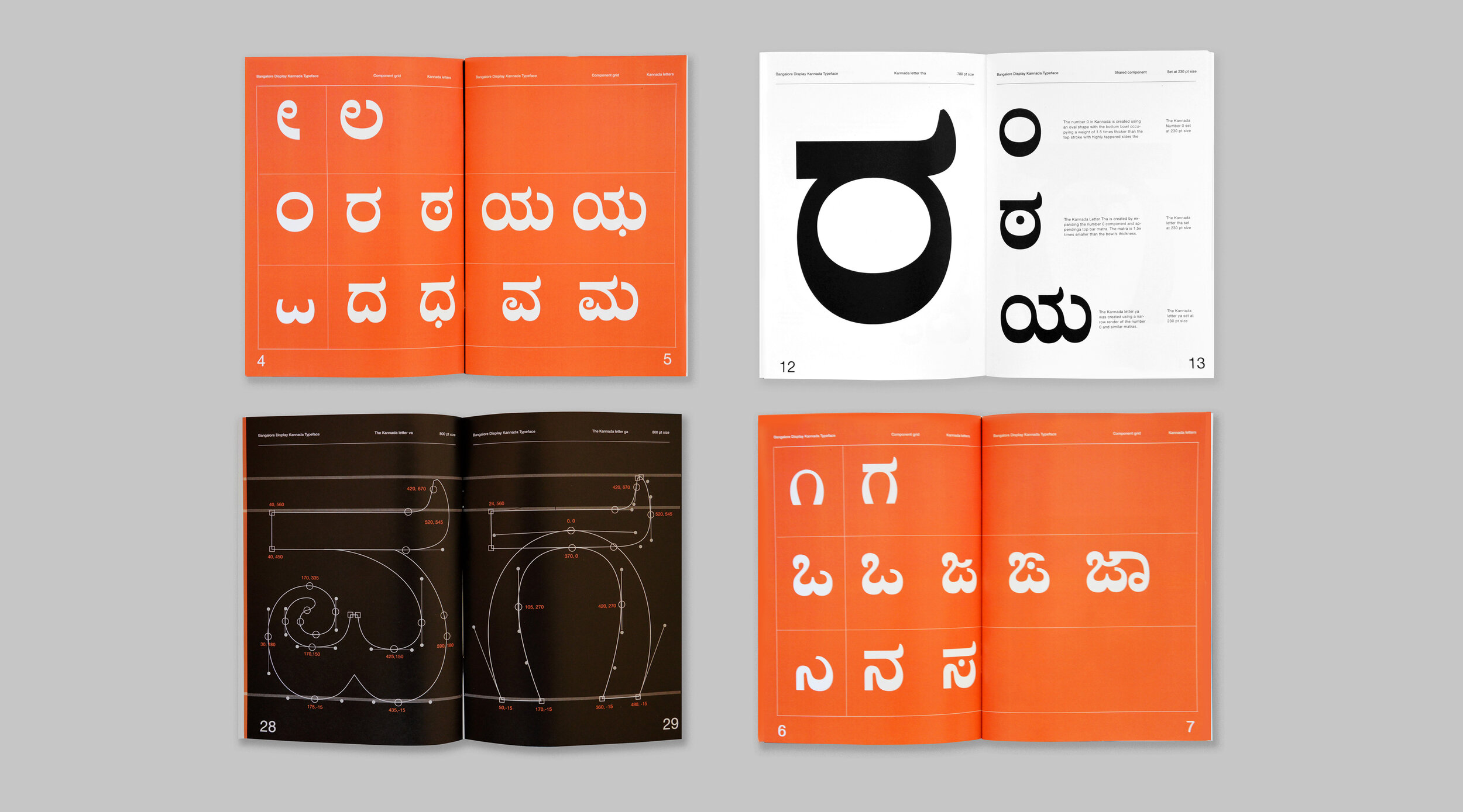
Bangalore Display is a playful, and bold Kannada, (a South Indian Language), typeface inspired by the hand lettered street signs scattered across my childhood home, Bangalore. The friendly and bubbly appearance of the typeface intends to appeal to a younger demographic and make the language accessible to them. It is displayed on an interactive microsite that breaks down the nuances and stylistic choices behind the typeface to help users appreciate the details that went into the design. The typeface is accompanied by a compendium that documents my process of learning the language Kannada while designing the typeface. It includes personal reflections about experimenting with different materials followed by deeper conversations with type experts. By making the language accessible to young Indians, I hope the project inspires them to appreciate the beauty of Indian languages and encourages them to engage with their mother tongues.
Roles
Typeface Design, Editorial Design, Web Design and Development, Animation, Photography
Tools
Glyphs 3, Adobe Photoshop, Adobe Indesign, Adobe After Effects, HTML/CSS/Javascript

Website Design
I designed and coded a Microsite to host the typeface. The site breaks down the stylistic choices of Bangalore Display in an interactive way to help a user appreciate the craft behind the typeface design and by extension, see the beauty of the language too.

Type Design Compendium
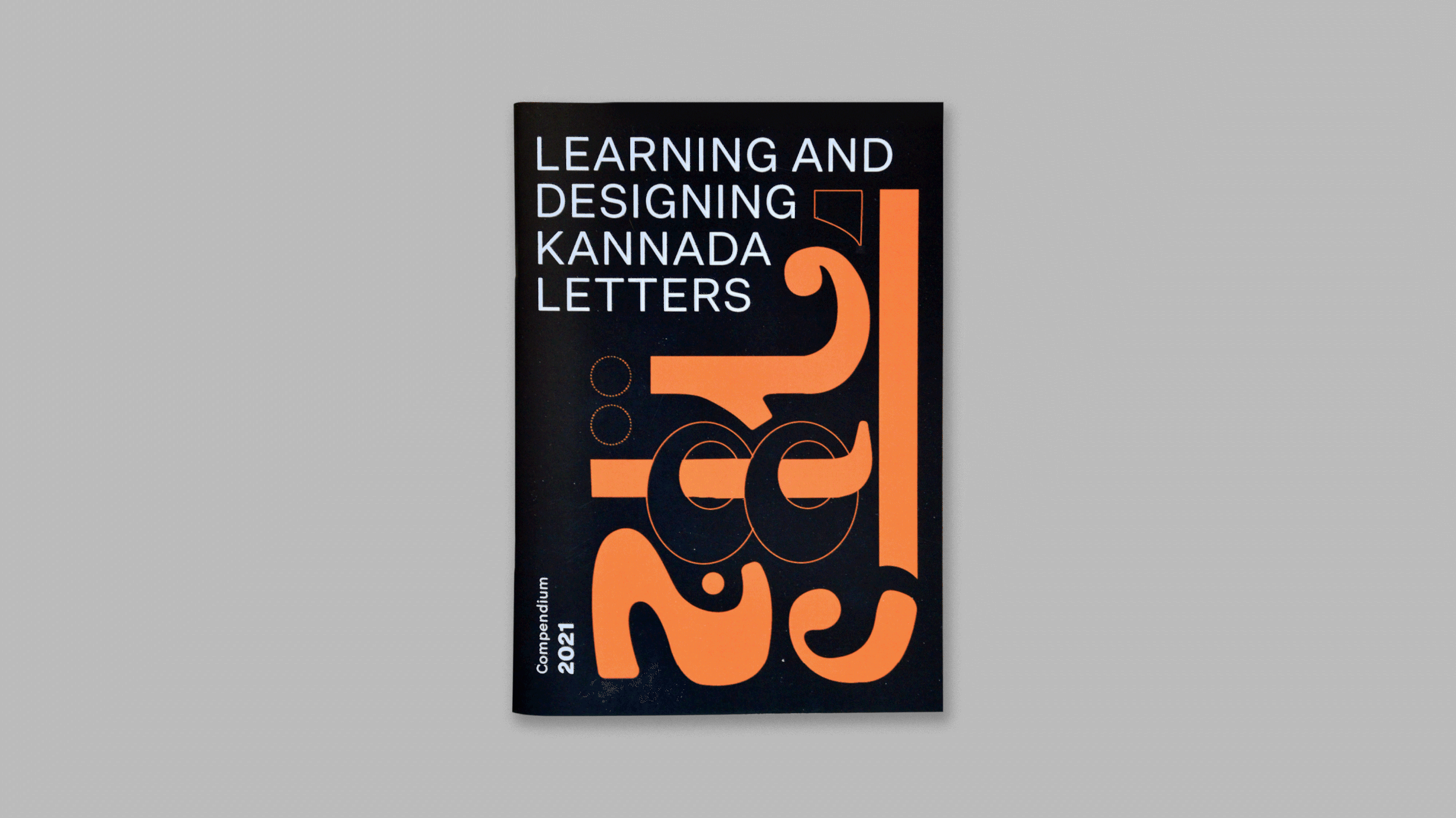
Throughout the design process I maintained a design Compendium. It is a reflective book that documents my experiments with type design, conversations with Type Experts and introspective questions I thought about and read arguments around. While the typeface is inspired by street lettering across Bangalore, India, the forms were created by drawing the letters with a flat edge ice-cream stick and digitizing the drawings. The compendium is an intersection of digital and analog imagery to reflect the process of the typeface.


I wrote about my experience designing a typeface in a language I cannot speak in a Medium article